LIKE A BIRD OUT OF AN EGG : BLACK MONSTER
The men’s total grooming brand Black Monster has undergone a major renewal. Recently, the brand released a film communicating its philosophy and message, while introducing bold changes across product ingredients, sizing, packaging, product lineup, and overall brand identity. In this project, I was responsible for planning the brand film, directing and producing the key visuals, and designing the website, ensuring a cohesive and consistent brand experience across all touchpoints.

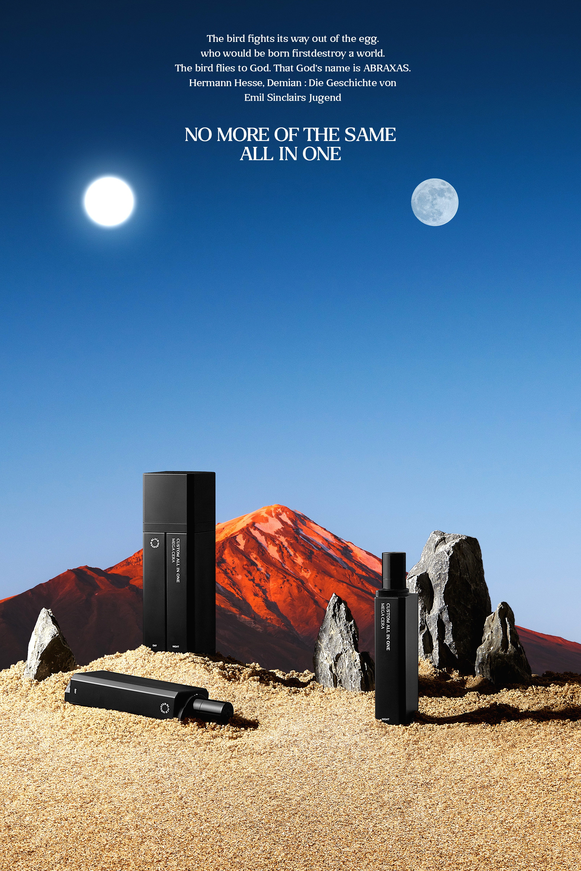
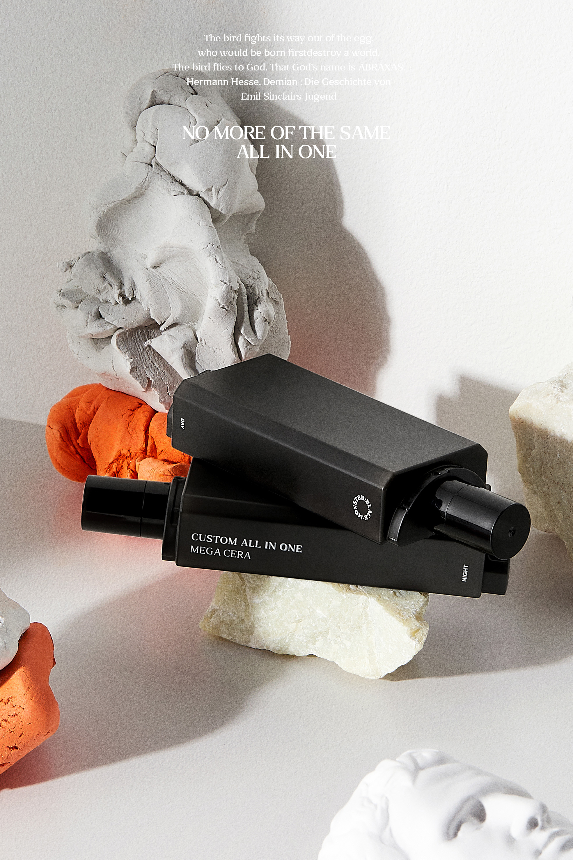
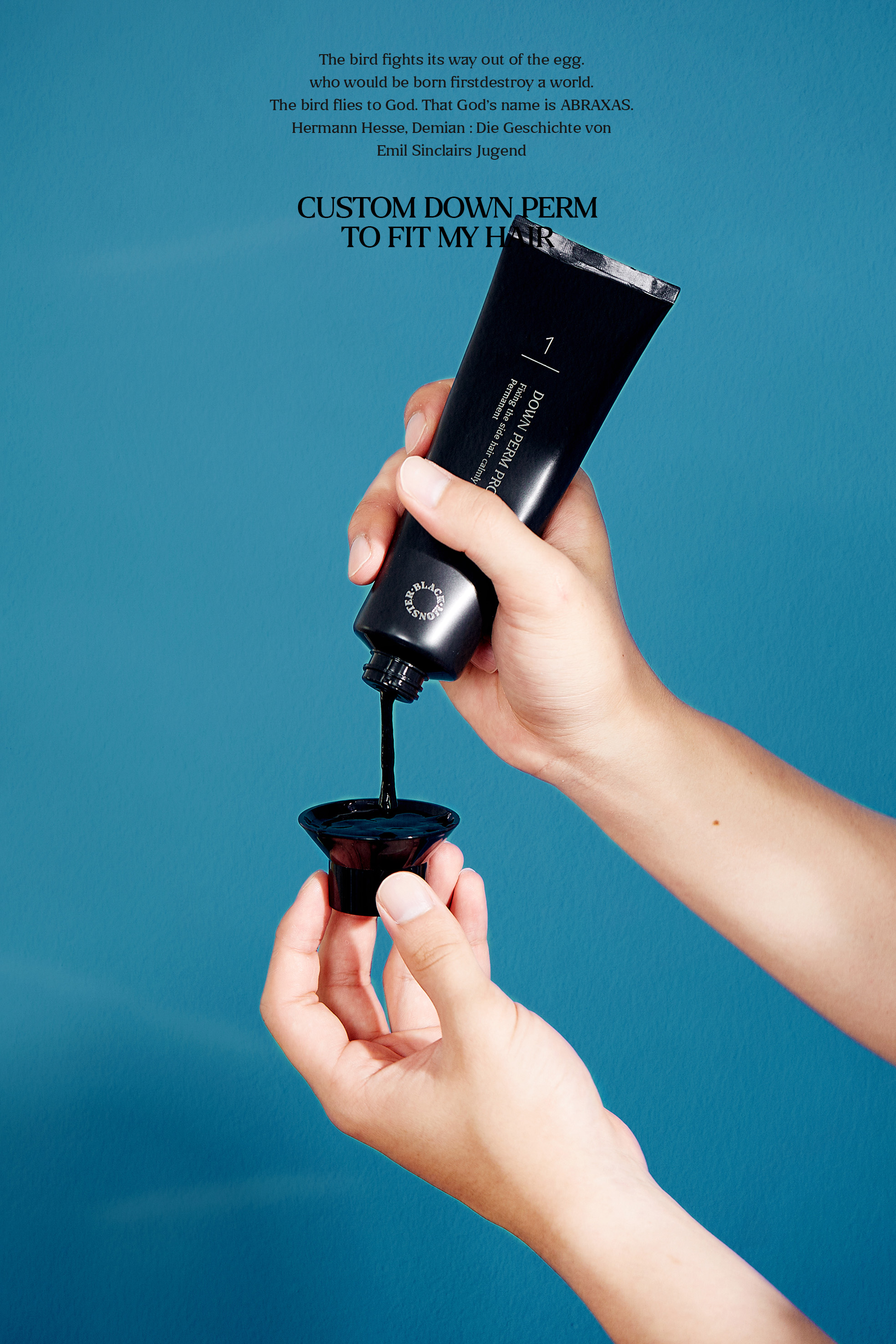
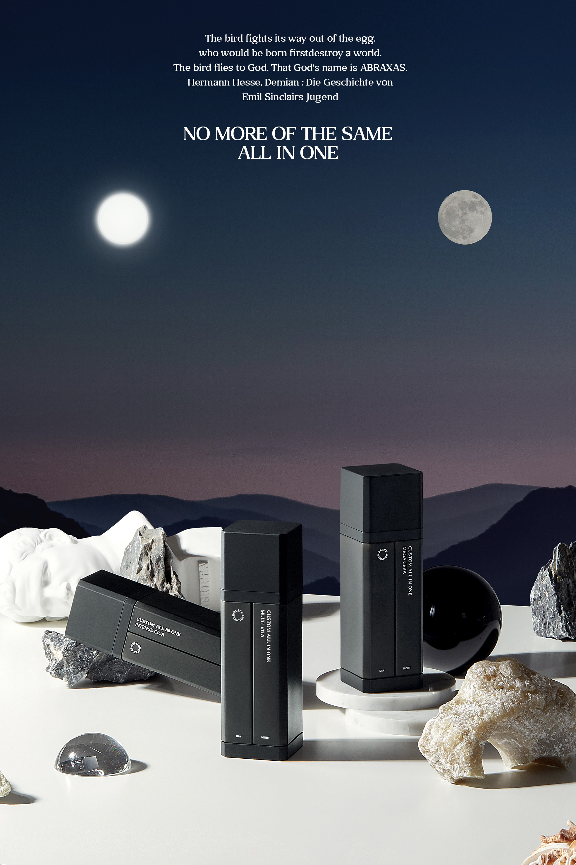
We planned a conceptual image to effectively showcase the brand’s main products. For Custom All in One, we created visuals that symbolize day and night, representing the product’s versatility across different moments of daily life. These visuals draw from the direction of the rebranded identity, yet focus on highlighting the product itself—emphasizing its unique functions by associating them with the contrasting symbols of day and night.
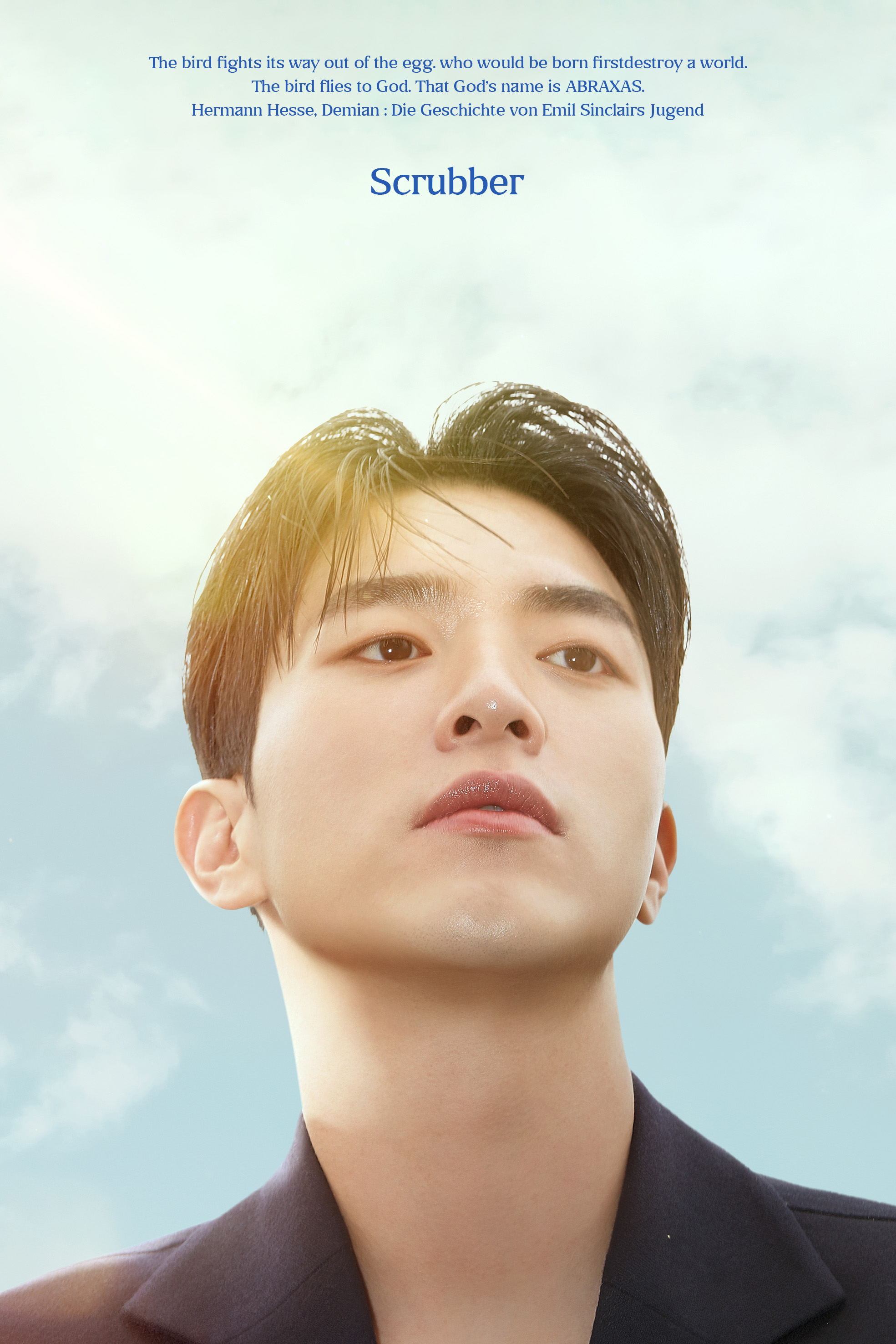
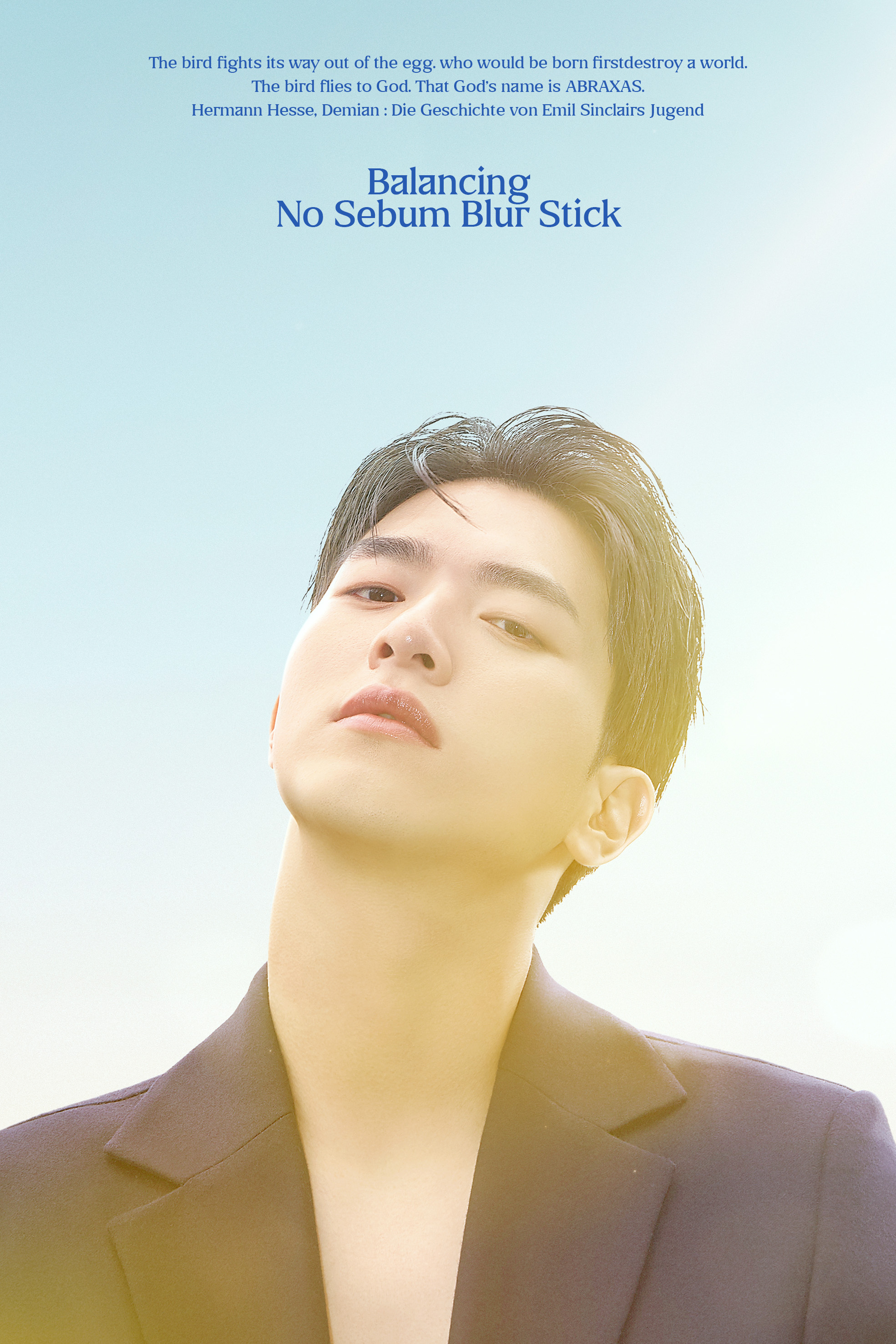
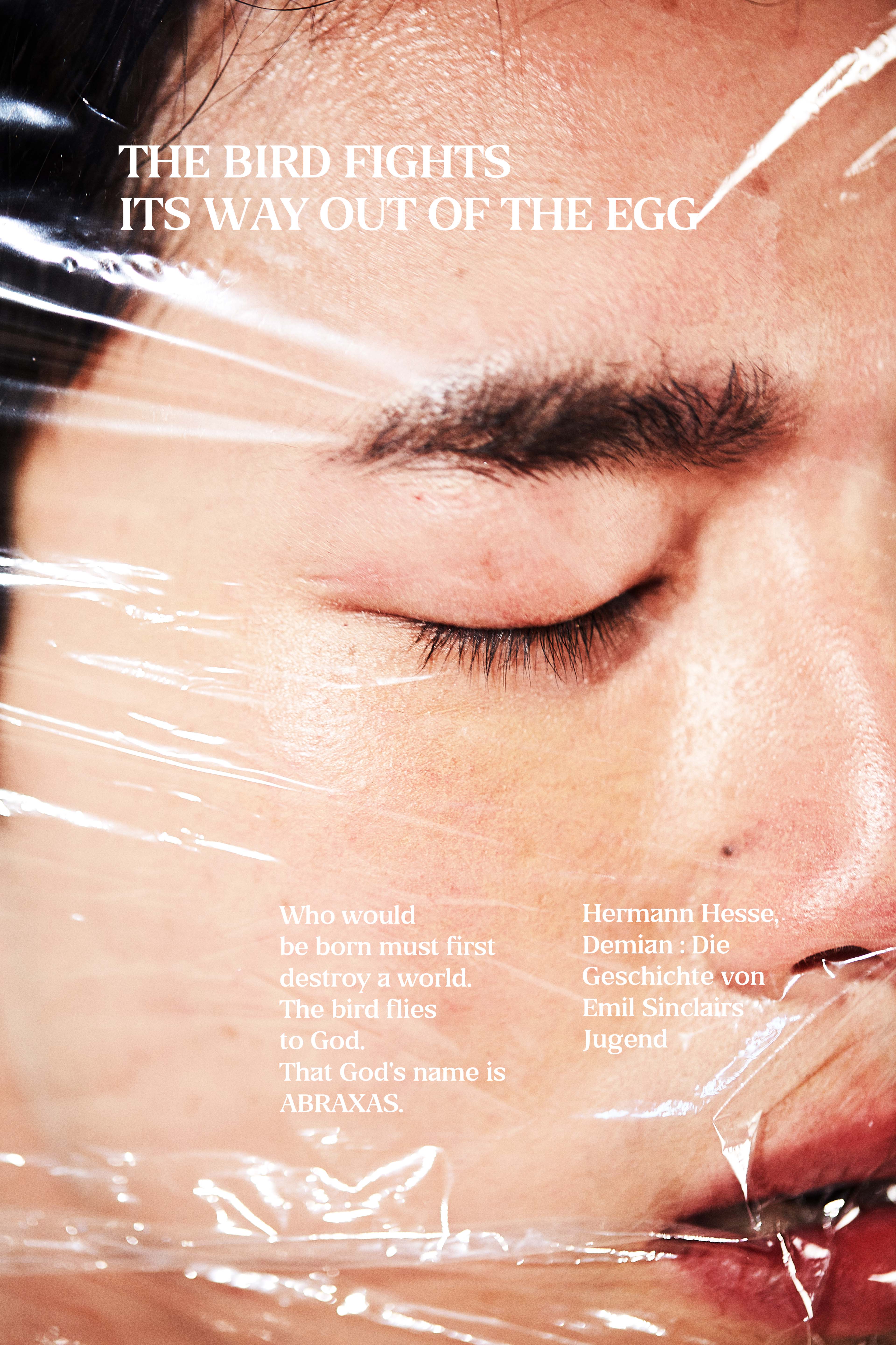
Our focus was to break from the conventional images of men often seen in other brands. These brands tend to portray beauty through stylized ideals—feminine aesthetics or K-pop idol looks—that everyday men cannot easily identify with. Black Monster instead aimed to depict inner beauty, affirming authenticity and self-acceptance.


Our visual communication approach began with asking “why.” Since consumers seek clarity in how a brand delivers visual impact, we built the slogan and overall brand visuals upon a clearly defined key message.